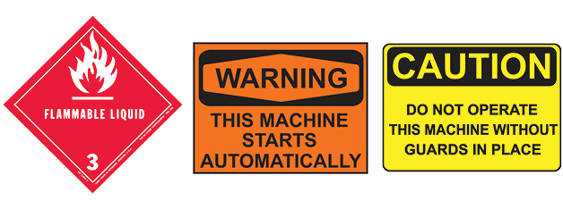
When it comes to the safety management systems your business has in place, there are key areas that should not go overlooked. Most involve Personal Protective Equipment (PPE), to proper training of equipment in use. One factor that is always in place is proper signage indicating a potential threat or hazard to your employees.
Much of the design, selection of colors, and information presented on safety signage is governed by both the Occupational Safety and Health Administration (OSHA) and the American National Standards Institute (ANSI). These two organizations have established protocols that are standard across all workplaces. Violations of these workplace prevention efforts is not only illegal but can result in serious fines.
Classification
OSHA defines that all signage should be broken into three classifications. The colors of the signs themselves, lettering, and information presented is based on the immediate threat level to the worker.
For signs that indicate that users must take special precautions to immediate dangers that are indicated in red, black, and white colors are strictly for danger signs. These signs represent the highest threat level that can result in injury or death.
 To protect your workers from common everyday hazards and also promote a safer work environment that condones unsafe practices, OSHA has made all Caution signs have a yellow background and black panel with yellow lettering. Furthermore, it should be noted, that the color of the letters used against the yellow background is required to be black.
When general instructions and suggested safety measures need to be conveyed, OSHA requires that Safety Instruction signs feature a green panel, with white letters, and that all letters used on the background will be only black.
Sign Specification and Placement
Both nationally and internationally, signage formats continue to evolve and become more standardized. This allows for quick understanding of safety precautions beyond potential language barriers. You may have often see signs utilize the words Danger, Warning, Caution, and Notice. These four words also indicate different threat levels.
Danger should not be overused and be restricted to the most extreme circumstances where a safety hazard poses the most severe risks, up to and including death. Warning falls just below Danger, and more commonly used to indicate of a potentially hazardous situation. Caution relates to a situation that may result in minor to moderate injury to your workers, while Notice is to indicate important information that is not directly hazardous.
In terms of placement, ANSI requires that signage must be legible and in the vicinity of equipment or area of the potential hazard, such as high voltage panel locations or potential flammable or combustible chemical storage units. In low light areas, safety signage must be illuminated or feature low-light reflectivity markings for better visibility.
Safeguarding Yourself
According to the Bureau of Labor statistics, approximately 2.9 million nonfatal workplace injuries were reported by private industry employers in 2016. Be sure to note the signage involved in your daily operations. Be aware of safety installations such as eyewash stations, fire control and suppression devices, and any slip-trip-and-fall hazards that you might encounter. Accidents happen, but if you take proper precautions you can have a much safer working environment.


